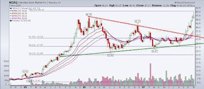
Well, NDAQ finally broke out of the crystal clear two year long symmetrical triangle consolidation after it's huge move up from a $5 Pink Sheet stock to a $45 listed juggernaut...As we will see from the chart below - It broke out and shot up from $31 to $50 in 2 months or so, but retreated after making a big move on it's acquisition of the Philadelphia Stock Exchange.

This chart was screaming at me during the summer and was one of the names I liked as a Long when the market was tanking hard in mid-August before the FED rescue... Another example of how certain chart patterns can be used to predict price movements with a high percentage of success...There is nothing better than negative sentiment for long periods and frustration to propel a stock higher...

This was probably one of my first charts...I came upon this one because a law school colleague of mine was working at a company that had been taken over by NASDAQ and the company was about to be listed on the Nasdaq Exchange as it was previously only on the Pink Sheets...Let's just say it broke out!!!

No comments:
Post a Comment